Why it exists
Vestly started as a digital wardrobe, but research revealed a stronger need: knowing whether an item works before buying it. I narrowed the product to a virtual try-on MVP and designed its flow, UI, identity, and mobile prototype.
Wardrobe concept + try-on MVP · 2025
A fashion app concept that started as wardrobe management and was narrowed into a virtual try-on MVP, combining UX research, brand direction, mobile UI, and React Native development.

01 · Idea
Vestly started as a digital wardrobe, but research revealed a stronger need: knowing whether an item works before buying it. I narrowed the product to a virtual try-on MVP and designed its flow, UI, identity, and mobile prototype.
02 · Product & design
Product case study
Vestly started as a broader wardrobe-management idea, then became a tighter MVP around the interaction that carried the clearest value: seeing an outfit on yourself before committing to it.
Original vision
A place to organize owned clothing, plan looks, and connect inspiration to what users could actually wear.
MVP decision
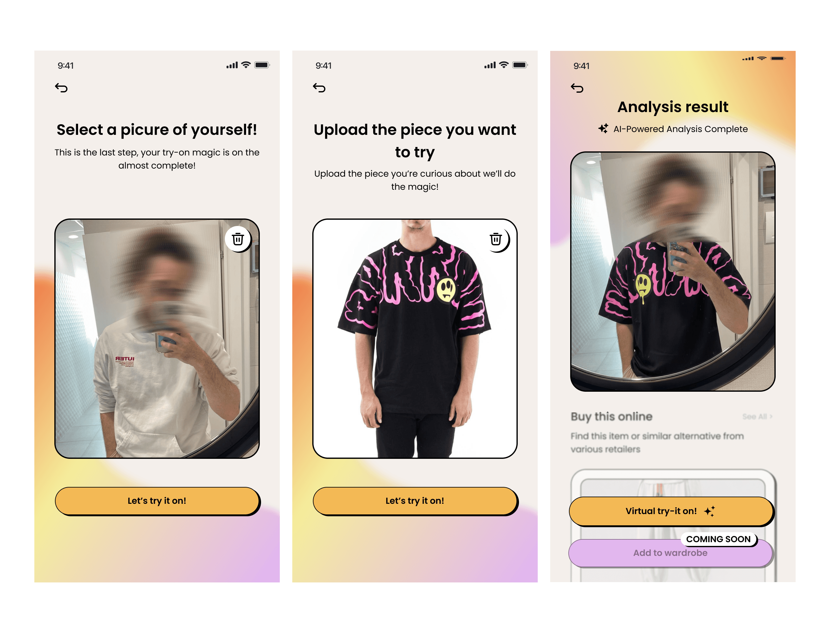
The first build focused on upload, preview generation, and result review instead of building every wardrobe-management feature at once.
Outcome
A focused mobile prototype with onboarding, profile setup, image upload, AI try-on states, final UI direction, and launch visuals.
Research synthesis
The research was lightweight and directional: enough to understand how people think about their wardrobe, shopping confidence, and outfit planning before committing to a full product scope.
The original raw survey export is no longer available, so this section is written as a qualitative synthesis of the findings that guided the MVP.
People described choosing from familiar pieces and forgetting items they already owned, especially when planning looks quickly.
The biggest friction was not just organization: users wanted to know whether a piece would work on their body, proportions, and style context.
Screenshots, saved posts, and product photos were already part of the decision process, which made image upload a natural MVP entry point.
A full wardrobe import felt heavy for a first session, so the MVP needed to create value before asking users to catalog everything.
The broader wardrobe concept still shaped the product logic: organization, smart suggestions, outfit building, try-on, then saving a look for reuse.
The build was narrowed to the highest-risk interaction: getting from a clothing image to a believable try-on preview.
Design evolution
The strongest part of the case study is the visible progression: early functional thinking, low-fidelity structure, high-fidelity UI, and a brand layer that made the product feel less like a tool and more like a fashion experience.
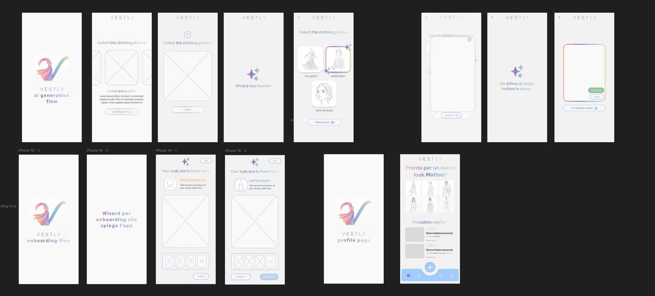
Early screens explored login, onboarding, try-on, saved outfits, and future wardrobe surfaces before the scope was reduced.
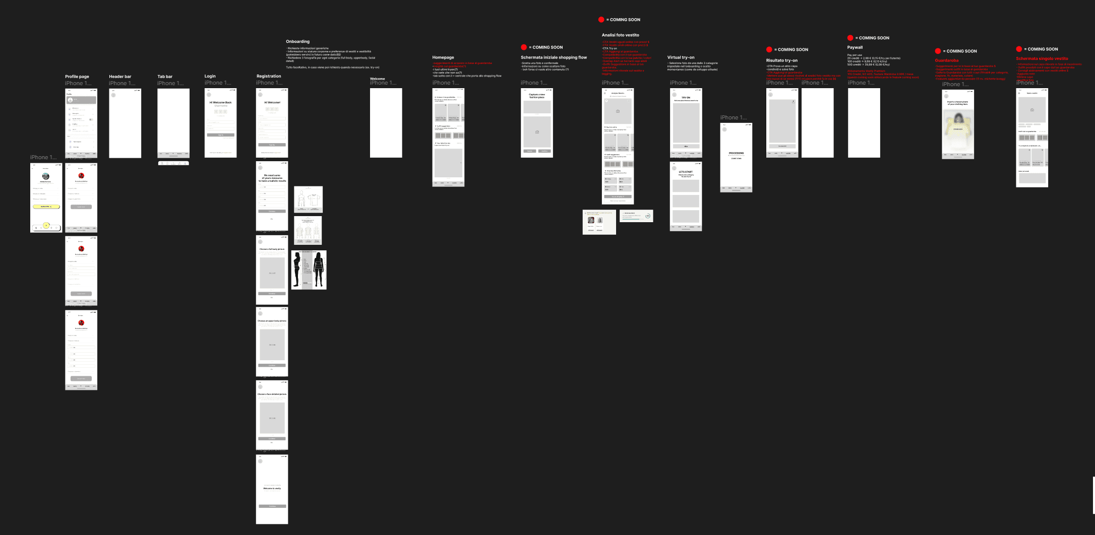
Wireframes cleaned up the onboarding and upload sequence, with placeholders for image selection, confirmation, and result states.
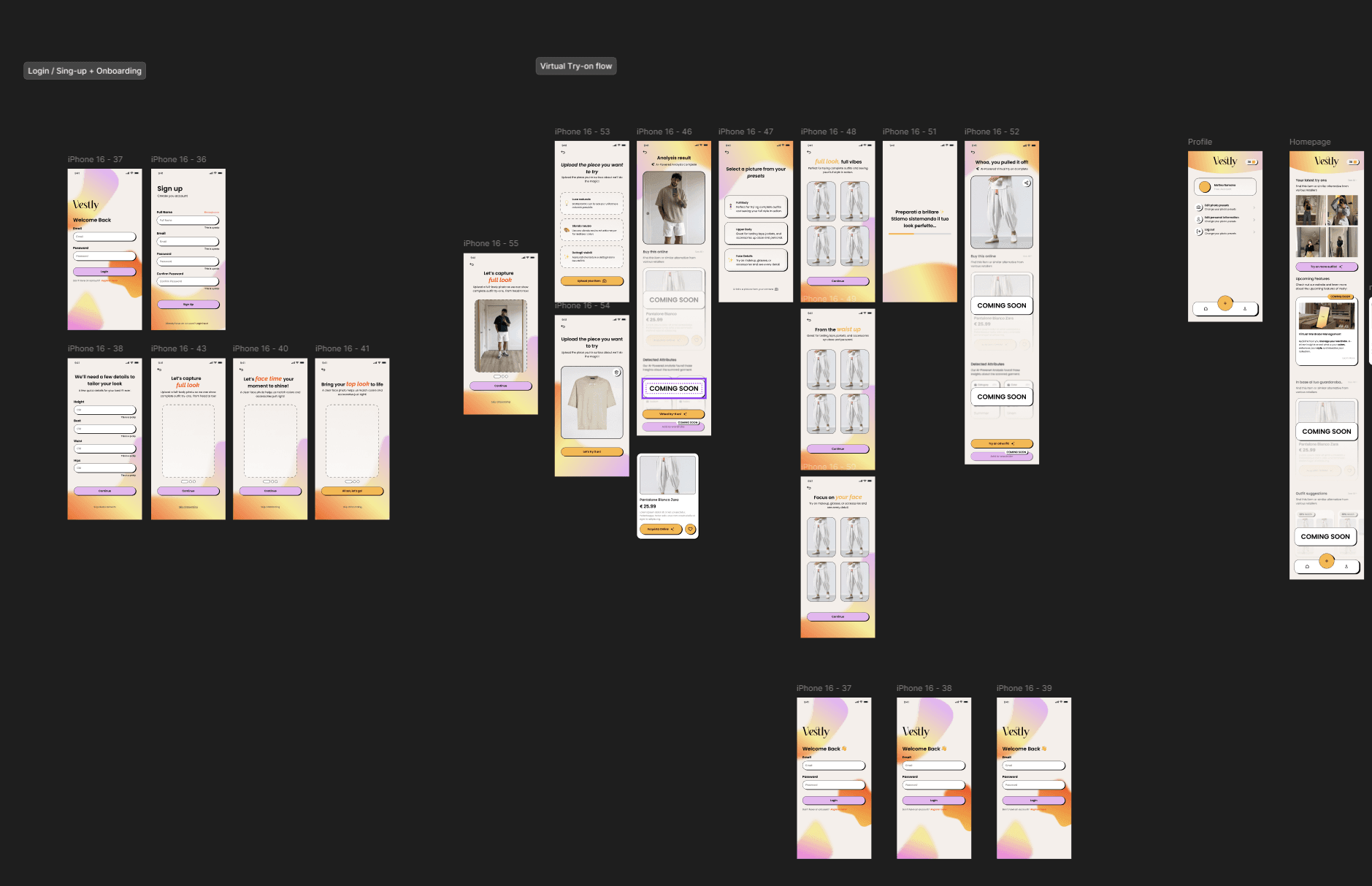
The final direction added clearer hierarchy, stronger CTAs, warm gradients, product cards, loading moments, and coming-soon boundaries.
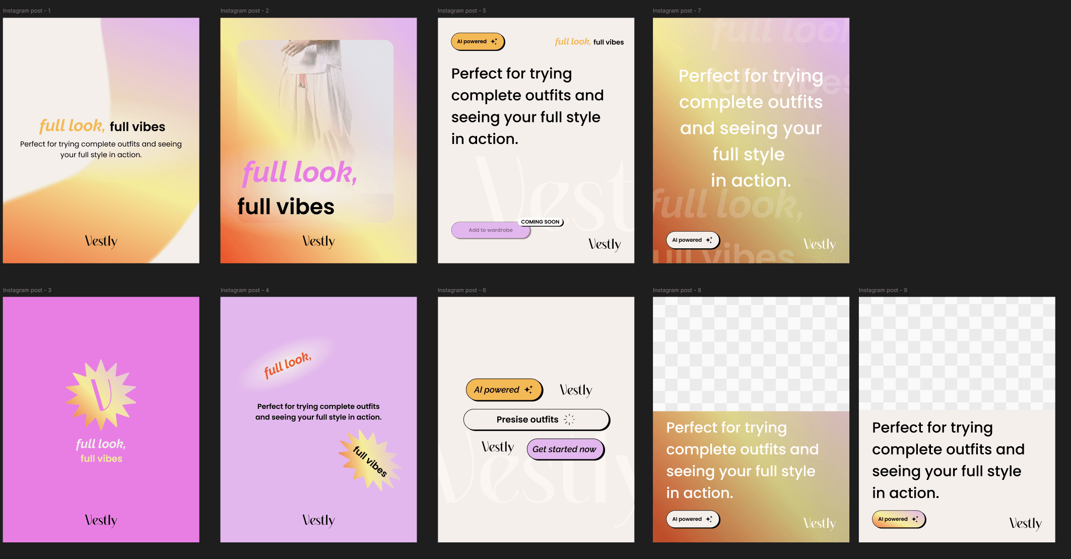
Social and brand explorations tested the softer fashion tone: full look, full vibes, AI-powered cues, and a more editorial rhythm.
Visual identity
The brand system uses a sharp wordmark against warm gradients, black UI accents, and rounded mobile controls. Poppins handles product clarity, while Raleway gives the identity a softer editorial note.
Wordmark
Old mark

Palette
#f7f0ea
#f7bf4d
#dfa8f4
#f66b35
Typography
Poppins
Product labels, buttons, guidance, and mobile UI clarity.
Raleway
Softer editorial moments and brand-led communication.
full look,
full vibes
Perfect for trying complete outfits and seeing your full style in action.
03 · Engineering