Posters & content
Visuals for events, announcements and results, with a hierarchy that puts the message first.
Images, color and typography can change the energy of a story. I create compositions and digital content with a distinctive character. Today my selection comes from sport and esports: a starting point, not a boundary.
Composition / Color / TypographyHave an event, an announcement or a story that needs a visual presence?
Let’s talk ↗Visuals for events, announcements and results, with a hierarchy that puts the message first.
Cutouts, lighting, textures and color grading: from the starting photo to the final visual.
Coordinated graphics that preserve a project’s character across different subjects and content.
From words to work
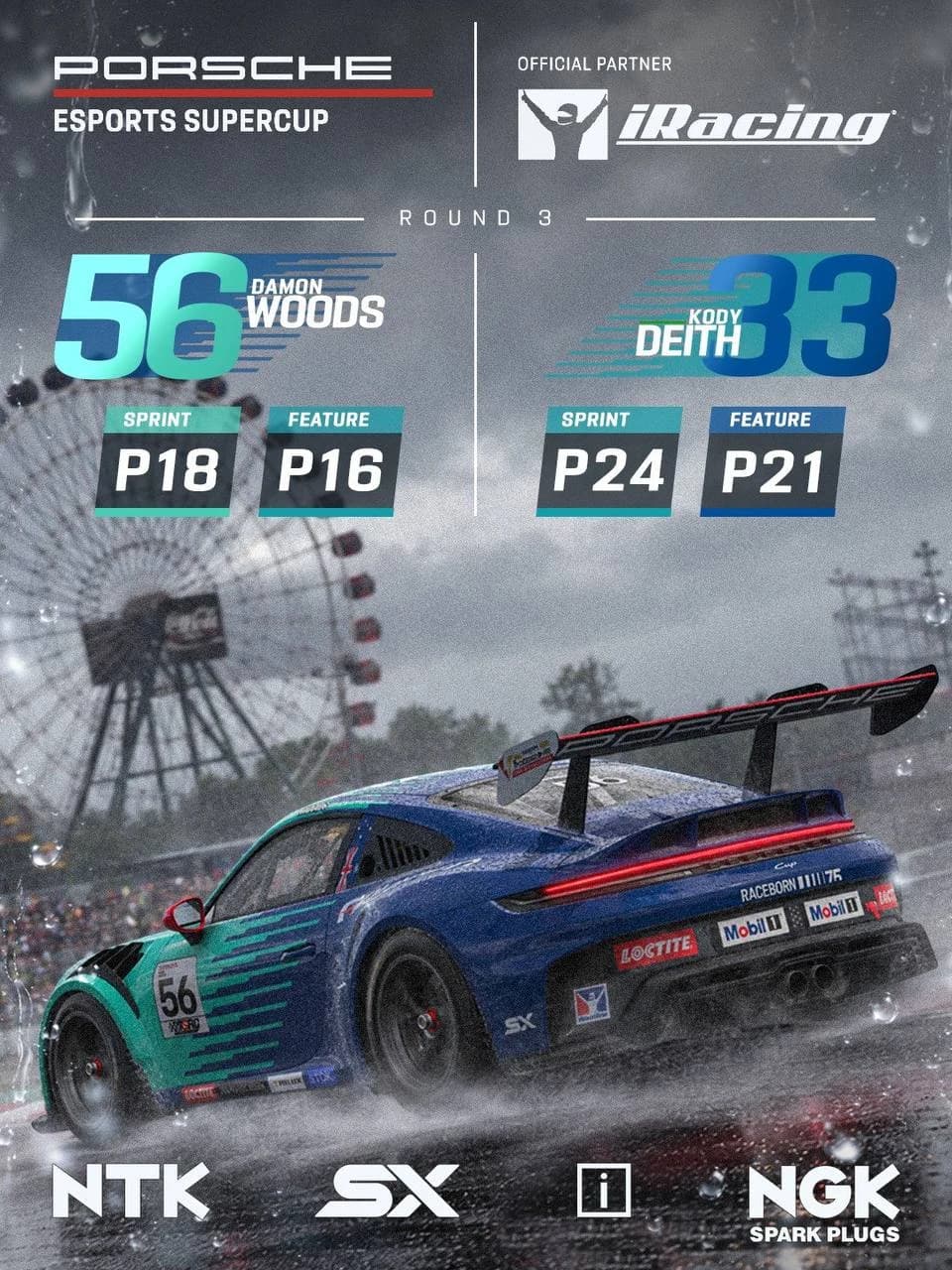
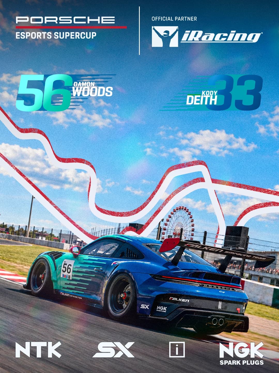
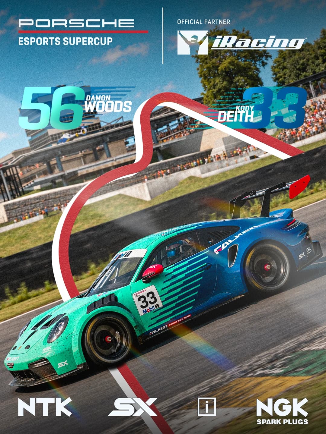
Three visuals for the Porsche Esports Supercup. From rainy compositing to circuit-inspired compositions.
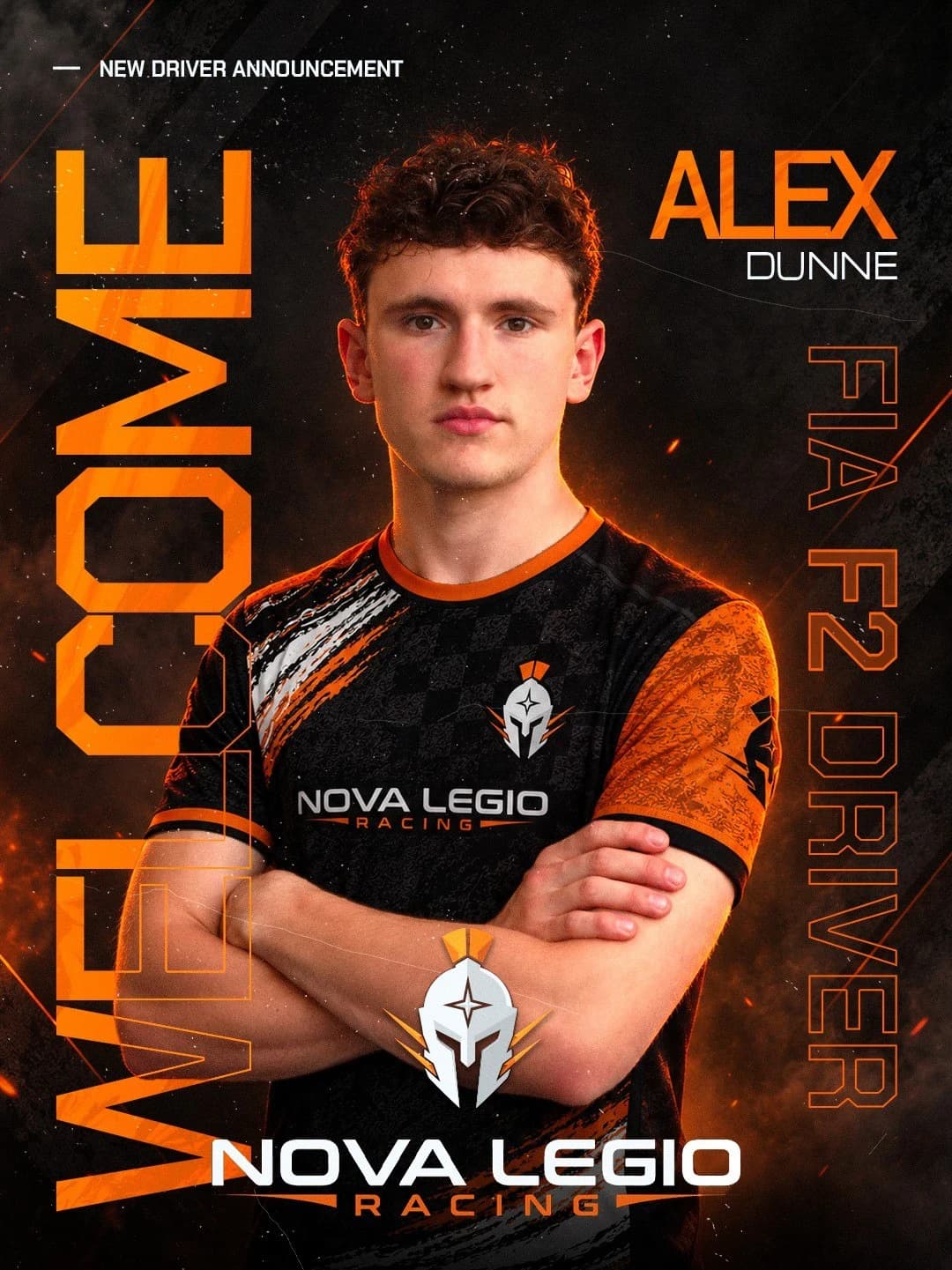
Alex Dunne’s announcement, with a jersey transformation, orange lighting and typography. Explore the before and after.
Every project changes the starting point. The approach stays the same: clarify, build, collaborate and refine.
Announcement, event or result: content comes first. We define the audience, publishing context and information hierarchy.
Images, references, color and typography set the tone. The composition starts with the message, not a collection of effects.
I work on cutouts, lighting, textures and color grading. Every element should belong to the same image, even when the sources differ.
I check hierarchy and readability at publishing size. Formats, variations and exports are defined around the project’s actual uses.
The care stays the same. How we organize the work changes around what the project needs.
We define goals, starting materials and outputs. I can own this discipline or connect it to the others, within a clear scope.
Tell me about it ↗Frontend at the core, a design mindset and a collaborative approach. My projects show how I work; we can talk about the contribution your team needs.
Get to know me ↗The work on display today is mainly sport and esports. That is my starting point: for other contexts, we can explore the message, materials and visual direction together.
This selection documents posters, compositing and digital content, rather than complete brand identity projects. For broader needs, I prefer to clarify the scope before promising a package.
Yes. The gallery includes interactive before/after comparisons showing the starting photo and final visual, alongside the complete collections.
Responsive, accessible interfaces that feel alive. From design to code, without losing the details along the way.
02 / I give it direction.Web & product designFlows, prototypes and UI for websites and digital products. A good-looking interface starts with a clear idea.